
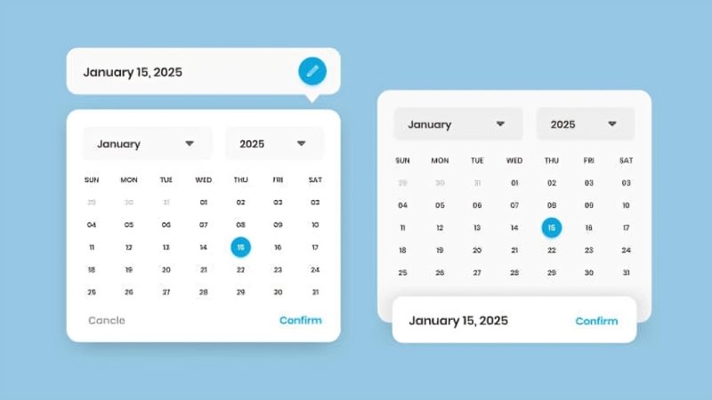
Creating intuitive and accessible date picker interfaces is fundamental in delivering seamless user experiences across diverse applications. A thoughtfully designed date picker helps users select dates effortlessly, reduces input errors, and supports accessibility standards. Whether for scheduling, booking, or forms, a quality datepicker UI provides significant value by streamlining interaction and minimizing frustration.
As users today access web applications on a wide range of devices and with various assistive technologies, date pickers must be adaptable and inclusive. A poor date selection experience may disrupt workflows or exclude users entirely, whereas an effective one can positively impact engagement and satisfaction. Understanding current approaches and common challenges is essential for creators prioritizing user-centered design in modern interfaces.
Understanding User Needs
Effective date picker design begins by recognizing how and why users will interact with it. Developers and designers should ask questions like: What is the core purpose behind the date input? Are users choosing a single day, or do they need to select a date range? Will interaction occur primarily on mobile devices or desktops? Are there specific accessibility needs, such as compatibility with screen readers?
Addressing these questions ensures that the date picker aligns with expectations and enhances usability. For example, a travel booking platform may require a range picker for departure and return dates, whereas a birthday input might only need a single selection. By focusing on user context, designers can avoid pitfalls and build components that support actual needs.
Leveraging Native HTML Date Inputs
Native HTML date inputs, like <input type=” date”>, offer built-in functionality that addresses many accessibility and compatibility concerns. These elements automatically incorporate keyboard support, comply with screen readers, and provide users with familiar controls, particularly on mobile devices. Modern browsers handle localization and formatting, ensuring consistency for global audiences.
Despite their advantages, native date pickers have drawbacks such as limited styling options and inconsistent appearance across browsers. They are ideal for simple use cases with straightforward requirements or when rapid development is prioritized over customization. Native inputs are less suitable when advanced features or brand-driven design is needed, but remain a reliable default option due to their simplicity and standardization.
Implementing Custom Date Pickers
Custom date pickers fill the gap when projects demand advanced functionality or bespoke visuals. Solutions built from scratch or with third-party libraries can deliver features like date range selection, multi-calendar views, recurring dates, or integration with time inputs. Designers gain freedom to tailor the interface to a brand identity and synchronize it with other components for a cohesive user experience.
However, custom pickers introduce more complexity. Developers must maintain accessibility by managing keyboard navigation, ARIA attributes, and ensuring that screen readers fully interpret the interface. User testing is vital to confirm that enhancements do not inadvertently hinder usability for those relying on assistive technology. For inspiration and in-depth analysis of interface variations, consult research from major publications like Smashing Magazine.
Ensuring Accessibility
Accessibility is a foundational element of quality UI design. Adhering to the Web Content Accessibility Guidelines (WCAG) enables a wide audience to interact with date pickers effectively. All components must be accessible using a keyboard, with logical tab order and clear focus indicators. ARIA roles and attributes help communicate structure and state to assistive technologies.
Errors and edge cases must be considered. If certain dates are unavailable, screen readers should be informed, and visually, such days should be grayed out or marked as inactive. Running usability tests with real users, especially those using assistive tools, reveals potential barriers and validates the interface’s inclusivity. Organizations like the Nielsen Norman Group offer extensive resources on accessibility best practices.
Designing for Mobile and Desktop
User expectations and interaction methods vary widely between devices, so a good date picker design is responsive and adaptable. On mobile devices, date selection should leverage native controls or custom touch-friendly interfaces, such as scrollable wheels or lists. Buttons and interactive elements require generous tap targets, and bottom sheets provide ergonomic advantages by placing menus within easy reach.
For desktop users, larger modal calendars with clear navigation controls and clickable date cells are ideal. Features like hover states, inline error messages, and tooltips can provide context or additional information without overwhelming the interface. Desktop designs should make full use of display space, while still optimizing for accessibility and ease of use.
Best Practices for Date Picker Design
- Clear Labeling: Users should instantly understand what is being asked. Use concise, descriptive labels and helper texts.
- Input Validation: Incorporate real-time validation for impossible or illogical dates, such as February 30 or past dates, in a booking system. Feedback should be immediate and comprehensible.
- Highlight Invalid Dates: Use recognizable visual cues like grayed-out text or disabled buttons to communicate unavailable selections, such as blackout periods or holidays.
- Optimize for Localization: Respect regional differences by offering date formats familiar to users based on their location, and allow overrides where feasible for full customization.
- Test Across Devices: Comprehensive testing assures consistent performance on all common browsers and devices, identifying unforeseen problems in real-world scenarios.
Following these best practices cultivates intuitive, robust, and scalable date picker components that elevate the overall user experience. For ongoing learning, designers can reference usability research and trends on platforms like UX Collective.