
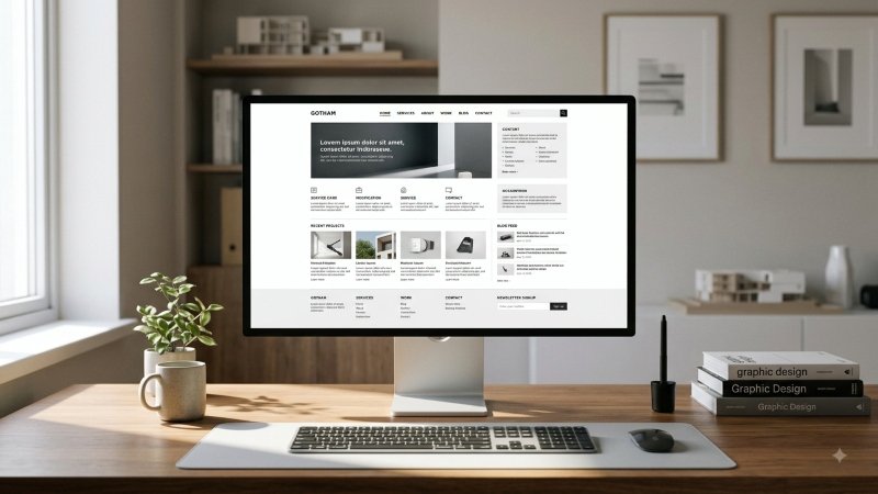
Minimal web design remains appealing because it can make a busy online experience feel calm, focused, and easier to understand. Looking at examples of minimalistic ui can help teams identify useful patterns, but the goal is not to copy a sparse visual style. The goal is to help visitors reach an answer, complete a task, or make a decision without unnecessary friction.
A successful minimal website does not ask people to guess what a business offers, where a link leads, or what happens after they click a button. It uses restraint with purpose. Every headline, image, menu item, form field, and call to action should earn its place by helping the visitor move forward.
Key Takeaways
- Minimal design should remove confusion, not useful information.
- Clear hierarchy, readable content, and visible navigation matter more than visual emptiness.
- Accessibility improves the experience for every visitor, not only people using assistive technology.
- Testing with real users is the best way to tell whether a clean page is genuinely clear.
Why Minimal Design Still Matters
People often arrive on a website with limited time and attention. They may be comparing services on a phone, looking for support, or trying to complete a purchase while juggling other tasks. Fewer competing elements can help them focus on the most important information first.
Minimalism is therefore a method, not a fixed look. A website can use bold color, expressive photography, or detailed product information and still feel minimal if its structure is clear. The problem begins when visual reduction removes the context visitors need to understand the page.
Minimal Does Not Mean Empty
Thoughtful simplicity keeps the labels, explanations, and actions people need. Excessive reduction hides links, replaces words with ambiguous icons, and assumes visitors will understand an unfamiliar interaction. Useful restraint gives each element a role rather than removing elements to create more blank space.
For example, a service company may use a clean hero section with a single headline and a single button. That can work well, provided the page also quickly explains what the service does, who it helps, what the next step involves, and where visitors can find pricing, proof, or support. A shorter page is not automatically a clearer page.
Start With The User’s Main Question
Before choosing colors or animations, identify why a visitor is likely to arrive. A clear page should answer the central question near the top, then provide details in the order people need them.
- Write the visitor’s likely goal in one sentence.
- Place a direct answer near the beginning of the page.
- Use headings that reflect real questions, not internal jargon.
- Remove sections that do not support the visitor’s decision or task.
- Ask a new visitor to explain the page after a quick scan.
At a minimum, visitors should be able to tell what the website offers, whether it is relevant to them, what to do next, and where to verify important details. When those answers are hard to find, the design may look clean yet still require work from the user.
Build A Clear Visual Hierarchy
Visual hierarchy helps people understand a page without reading every word. Use one clear H1 to state the main promise, specific section headings to organize supporting ideas, and spacing to show which pieces of content belong together. Size, weight, position, and contrast should guide attention toward the message and primary action.
A useful check is to blur the page, step back from the screen, or view it on a small device. The main message, key action, and major sections should still stand out. Strong visual hierarchy does not mean making everything large or bold. It means making the right things noticeable first.
Use White Space With A Purpose
White space gives content room to breathe and can make a page easier to scan. However, too much space can split related ideas apart, push answers far down the screen, or make a page feel unfinished. Keep labels close to the fields and controls they describe. Use tighter spacing inside related groups and larger gaps between major sections.
Review spacing on mobile devices in particular. A gap that feels elegant on a wide desktop monitor can force a phone user to scroll past several empty screens before reaching useful content. Space should direct attention, not delay it.
Make Navigation Simple, Not Hidden
Keep the main menu short, but do not remove destinations that people expect to find. Familiar labels such as Services, Pricing, About, Contact, and Support are often more helpful than clever wording. Visitors should also know where they are through a clear active state, page title, or breadcrumb when the site has deeper content.
A menu icon may be appropriate on a small screen, but important actions should not depend on hover effects, unexplained symbols, or hidden panels. Websites with many pages should make it easy to locate the search. Menus, links, and controls should work with keyboards, touch input, and screen readers.
Protect Readability And Accessibility
Accessibility is a foundation of clarity. Use comfortable text sizes, enough contrast between text and backgrounds, visible keyboard focus, descriptive button labels, and meaningful alternative text for informative images. Do not communicate an error, status, or instruction through color alone.
The WCAG quick reference is useful when reviewing contrast, keyboard access, headings, labels, reflow, and motion. Plain language also matters. Forms should explain what is required, error messages should identify the problem, and instructions should not depend on visual position alone.
Keep Content Clear And Complete
Minimal layouts need concise content, not missing content. Use short paragraphs that cover one idea at a time, replace vague claims with specific details, and explain unfamiliar terms before repeating them. Bullets are especially useful for features, requirements, pricing differences, and next steps.
Do not cut important copy to preserve an airy layout. Visitors need enough information to judge whether an offer is right for them. If they must leave the page to find basic facts, the design has shifted effort from the business to the user.
Choose Visual Effects That Support The Message
Images, gradients, video, and animation can support a minimal interface by explaining a product, establishing context, or showing a meaningful change. They become distractions when they delay information, compete with the page goal, or make controls unpredictable. Compress media, avoid automatic movement that interrupts reading, and respect reduced-motion preferences.
Design For Mobile First
A layout that feels balanced on a large monitor can become difficult on a phone. Put the core message near the top, make buttons easy to tap, break long sections into scannable blocks, and test menus and forms with one hand. Review the experience on slower connections and older devices, not only on a designer’s newest phone.
A Practical Review Process For Minimal Websites
- Define the goal: State the visitor’s main task in one sentence.
- Map the content: Organize information around user needs rather than internal departments.
- Remove distractions: Cut repeated claims, decorative clutter, and weak calls to action.
- Check hierarchy: Confirm that headings, spacing, and contrast show the correct order.
- Test access: Review keyboard use, focus states, labels, alternative text, and zoom.
- Watch real behavior: Use feedback, search terms, support questions, and failed form attempts to find friction.
Common Mistakes To Avoid
- Using tiny, pale text because it appears refined.
- Replacing clear labels with icons that require interpretation.
- Hiding key links to maintain a clean header.
- Using oversized empty areas that bury useful answers.
- Adding motion before confirming the page works without it.
- Testing only with the design team instead of real visitors.
Conclusion
Minimal web design works when it creates focus without creating doubt. The strongest websites do not simply remove elements. They keep the right information, present it in a useful order, and make every important action easy to understand. A clean interface should feel calm, readable, accessible, and complete.
