
In the ever-evolving landscape of web design, top navigation bars have transformed to elevate both form and function. Designers now focus on options that ensure faster, more intuitive browsing, driven by user expectations and technology advancements. If you are looking for inspiration or want to see innovative examples in action, explore more on the web design navigation bar.
The homepage menu is often the user’s first point of interaction. A thoughtfully designed navigation bar not only impacts usability but also sets the visual tone. It can elevate a website’s style and keep navigation effortless so that visitors focus on content rather than getting lost in cluttered menus or complex architectures.
Today’s designers are moving toward navigation options that strike a balance between minimalism and functionality. This approach reduces cognitive fatigue for site visitors while engaging them through modern interactive features. Mobile compatibility, flexible search options, and personalization are quickly becoming non-negotiable expectations for leading websites.
For businesses and creatives alike, understanding the latest web navigation trends is crucial. Taking cues from current best practices can help ensure your site feels up to date, accessible, and visually refined, contributing to higher engagement and improved user satisfaction.
Minimalist Designs
Minimalism remains the prevailing aesthetic for navigation bars, helping users focus on what matters most. By removing nonessential links and visual distractions, minimalist menus create a clean interface. For both startups and established brands, a streamlined navigation system ensures clarity and reduces potential friction in the browsing experience.
Whether through whitespace, sleek icons, or simplified typography, these bars help direct user attention toward key actions, such as signing up, shopping, or reading feature content. According to Shopify, minimalist design can improve performance and load times, which are critical factors for keeping bounce rates low.
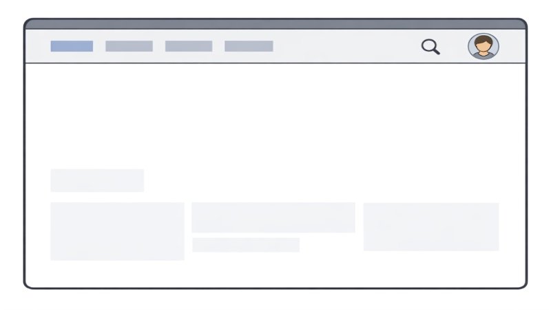
Sticky Navigation Bars
Sticky navigation bars have become a web design staple, ensuring links and primary actions remain visible no matter where users are on a page. This persistent approach reduces the need for scrolling and increases accessibility. Especially on long or content-rich sites, sticky navigation lets users switch sections quickly, so they never lose their place.
Designers often opt for subtle sticky effects, using slight drop shadows or transparency to keep the bar noticeable but unobtrusive. This design trend is particularly effective for e-commerce and portfolio sites, where persistent navigation helps users compare products or browse galleries with minimal effort.
Mobile-First Approach
As mobile browsing continues to overtake desktop, navigation design priorities have shifted. Building with a mobile-first mindset means designing interfaces for small screens first, then enhancing them for larger screens. Responsive navigation bars adapt seamlessly across devices, prioritizing tap-friendly interactions and compact layouts.
Hamburger menus, collapsible lists, and gesture-based navigation are tailored to mobile experiences, ensuring content remains accessible without overwhelming users. Flexibility is key, as users now demand a seamless experience whether they are engaging with a site on a smartphone or a widescreen monitor.
Personalized Navigation
Personalization in navigation introduces adaptive menus based on user behavior, history, and preferences. Websites can now recommend content, products, or features relevant to each individual, increasing engagement and conversion rates. For example, a logged-in user may see account options, recently viewed items, and favorite categories, while a new visitor sees general highlights.
This trend requires effective data collection balanced with privacy concerns, but when executed well, it demonstrates a brand’s attentiveness to each user’s needs. It turns routine navigation into an opportunity for discovery and interaction, driving loyalty as users feel the site is tailored for them.
Integrated Search Functionalities
Adding search functions directly into navigation bars meets users’ need for instant access to information. Rather than hunting through menus, users can jump straight to search, making the process intuitive and immediate. This is particularly valuable for content-heavy or ecommerce websites where users might arrive with a specific intent.
Smart search features, such as auto-suggestions and filters, further streamline the discovery process. Advanced search integration builds trust by showing users that a website supports efficient, direct exploration.
Conclusion
Staying informed about contemporary top navigation bar design trends is essential for building websites that don’t just look modern but perform well for users too. Minimalist layouts, sticky menus, mobile-first features, personalized experiences, and integrated search collectively contribute to a streamlined, user-centered site that stands out amidst the crowded web. As user expectations and digital standards continue to evolve, designers must remain adaptable and leverage these trends to deliver exceptional browsing experiences.